 GOVERNMENT OF INDIA


Start Date
07/08/2026 - 11:30
End Date
05/10/2026 - 23:45
Time zone: IST (GMT +5.30 Hrs)
1562
Total Submissions in this Task
57
Approved
1505
Under Review
Created: 7/08/2026

3 days 15 hours ago
अवधारणा एवं औचित्य
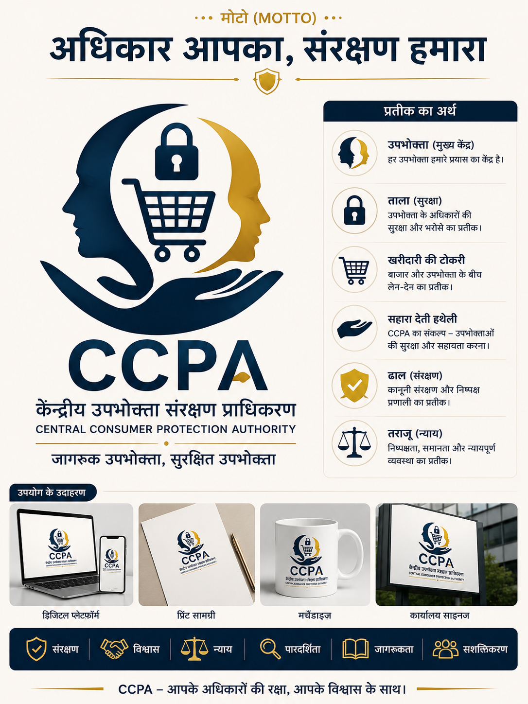
लोगो का केंद्रीय मानव प्रतीक जागरूक और सशक्त उपभोक्ता को दर्शाता है। ताला उपभोक्ता अधिकारों की सुरक्षा और विश्वास का प्रतीक है। खरीदारी की टोकरी उपभोक्ता और बाजार के सीधे संबंध को दर्शाती है। सहारा देती हथेली CCPA द्वारा उपभोक्ताओं को संरक्षण और सहायता प्रदान करने का प्रतीक है। ढाल एवं टिक-चिह्न सुरक्षित और संरक्षित उपभोक्ता का प्रतिनिधित्व करते हैं। न्याय-तराजू निष्पक्षता, समानता और न्यायपूर्ण बाजार का प्रतीक है। नीला रंग विश्वास एवं सुरक्षा, जबकि सुनहरा रंग निष्पक्षता और गरिमा को दर्शाता है। संपूर्ण लोगो उपभोक्ता अधिकार, संरक्षण, विश्वास और सशक्तिकरण के प्रति CCPA की प्रतिबद्धता को दर्शाता है।
Like
2
Dislike
1

3 days 16 hours ago
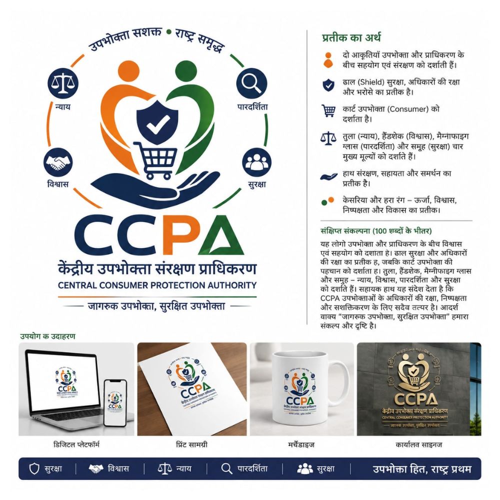
यह प्रतीक उपभोक्ता और प्राधिकरण के बीच विश्वास, सुरक्षा एवं सहयोग को दर्शाता है। ढाल उपभोक्ता अधिकारों की रक्षा एवं सुरक्षित बाजार का प्रतीक है, जबकि हाथ संरक्षण और सहायता को दर्शाता है। तुला न्याय एवं निष्पक्षता, आवर्धक काँच पारदर्शिता तथा समूह उपभोक्ता सशक्तिकरण का प्रतिनिधित्व करता है। शॉपिंग कार्ट उपभोक्ता की पहचान को दर्शाता है। केसरिया, हरा और गहरा नीला रंग ऊर्जा, विश्वास, निष्पक्षता, विकास और संस्थागत विश्वसनीयता का प्रतीक हैं। यह लोगो CCPA के उपभोक्ता अधिकारों की रक्षा, जागरूकता, निष्पक्षता एवं सशक्तिकरण के संकल्प को अभिव्यक्त करता है।
Like
4
Dislike
2

3 days 16 hours ago
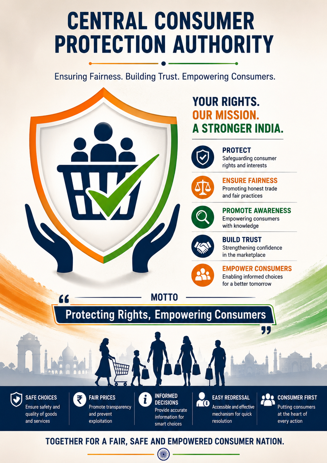
Logo Concept: The logo represents consumer protection, trust, fairness and empowerment. The shield symbolizes safety and protection of consumer rights, while the shopping basket represents consumers and the marketplace. The check mark signifies fair, safe and informed purchases. The use of the Indian tricolour reflects the authority’s role in serving and protecting consumers across India.
Motto: “Protecting Rights, Empowering Consumers”
Like
2
Dislike
1

3 days 16 hours ago
The logo presents a modern and simple concept of consumer protection. The protective hand and shield represent the CCPA’s role in safeguarding consumer rights, while the balanced scales symbolize equality and justice. The Ashoka Chakra represents India and national responsibility, and the three people signify consumers from different sections of society. The saffron, white, green, and navy-blue colour combination gives the logo a strong Indian identity. The motto “Protecting Consumers, Empowering Citizens” highlights the Authority’s commitment to consumer welfare.

Like
2
Dislike
3

3 days 18 hours ago
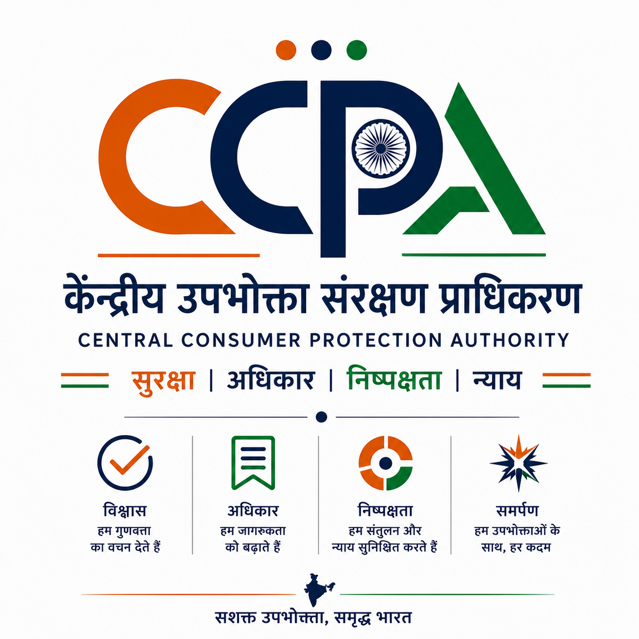
यह लोगो CCPA की पहचान को आधुनिक, सरल और विशिष्ट रूप में प्रस्तुत करता है। “CCPA” अक्षरों को एकीकृत करके बनाया गया प्रतीक प्राधिकरण की स्पष्ट पहचान दर्शाता है। अशोक चक्र भारत की संवैधानिक भावना, जिम्मेदारी और राष्ट्रीय मूल्यों का प्रतीक है। केसरिया, सफेद और हरा रंग भारत की एकता एवं राष्ट्रीय भावना को दर्शाते हैं। चार प्रमुख विचार—सुरक्षा, अधिकार, निष्पक्षता और न्याय—उपभोक्ता संरक्षण के मूल उद्देश्यों को व्यक्त करते हैं। न्यूनतम और संतुलित डिजाइन इसे डिजिटल माध्यम, दस्तावेज़, प्रिंट, आधिकारिक संचार तथा अन्य उपयोगों के लिए आसानी से अनुकूल बनाता है।
Like
7
Dislike
3

3 days 19 hours ago
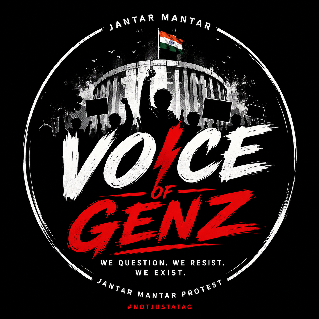
i have made a moto poster for genz protesting at jantar mantar
Like
9
Dislike
4

3 days 20 hours ago
केन्द्रीय-उपभोक्तृसंरक्षण-प्राधिकरणम् उपभोक्तृणां अधिकाराणां संरक्षणार्थं भारतसर्वकारेण स्थापितं प्रमुखं संस्थानम् अस्ति। अस्य मुख्यं कार्यम् उपभोक्तृहितस्य रक्षणं, अनुचितव्यापारप्रवृत्तीनां निरोधनं, मिथ्याविज्ञापनानां नियन्त्रणं तथा दोषयुक्तवस्तूनां विरुद्धं आवश्यककार्यवाही करणम् इति। एतत् प्राधिकरणं न्यायपूर्णं सुरक्षितं च व्यापारवातावरणं निर्मातुं प्रयतते
(0.22 MB )
Like
4
Dislike
3

3 days 21 hours ago
हर उपभोक्ता का अधिकार, विश्वास और सुरक्षा—एक मजबूत, पारदर्शी और न्यायपूर्ण भारत की नींव।
Like
1
Dislike
3

4 days 4 hours ago
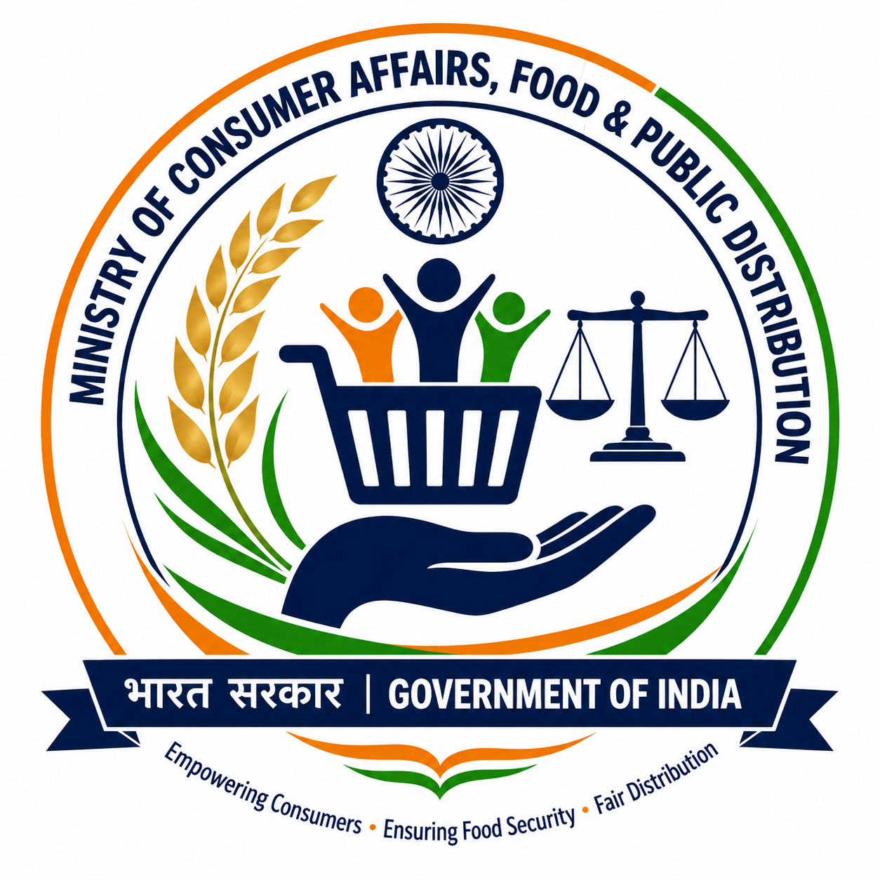
Consumer Rights • Food Security • Fair Distribution” 🛒 Consumer Basket + 🌾 Wheat Grains + ⚖️ Justice/Balance + 🇮🇳 Indian Identity Suggested logo wording: MINISTRY OF CONSUMER AFFAIRS, FOOD & PUBLIC DISTRIBUTION भारत सरकार | GOVERNMENT OF INDIA “Empowering Consumers • Ensuring Food Security • Fair Distribution” For a simple school/project logo, the central symbol can be described as: “A circular emblem containing golden wheat grains, a shopping basket symbolizing consumers, and a balanced scale representing fairness and consumer rights, with the Indian tricolour incorporated around the design.” create a logo
Like
4
Dislike
3

4 days 5 hours ago
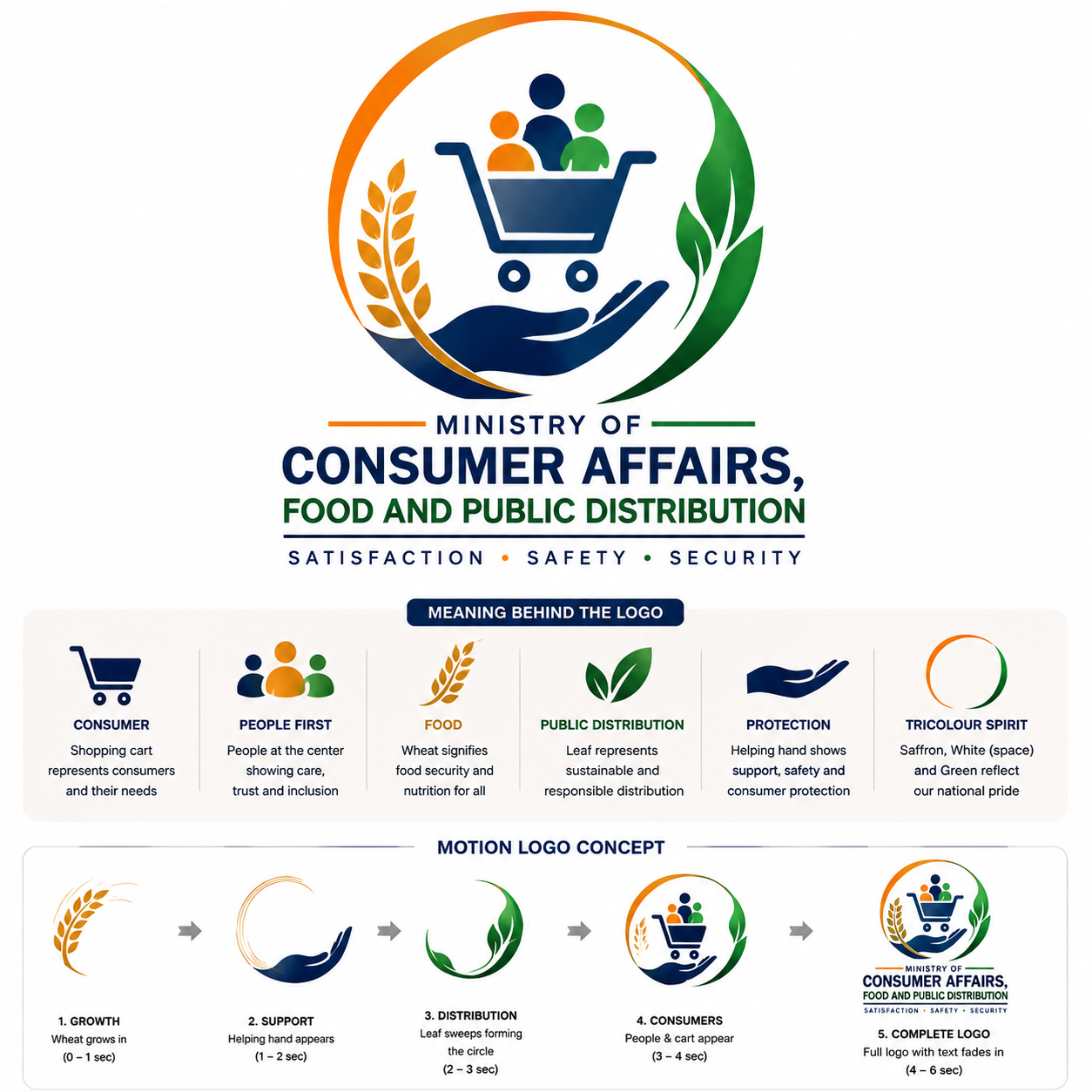
The logo represents the Ministry of Consumer Affairs, Food and Public Distribution through a modern, meaningful, and people-centric design. At its center, a shopping cart symbolizes consumers, fair markets, and access to essential goods, emphasizing that citizens are at the heart of the Ministry's work. Three human figures inside the cart represent inclusiveness, equality, and the welfare of every Indian family. A supporting hand beneath the cart signifies protection, trust, and the Government's commitment to safeguarding consumer rights. The golden wheat ear reflects food security, agriculture, and the Public Distribution System, while the green leaf represents sustainability, growth, and responsible resource management. The circular tricolour-inspired form symbolizes unity, continuity, and national progress. The colour palette of navy blue, saffron, green, and gold conveys trust, service, prosperity, and nourishment.

Like
3
Dislike
6
Please
Log In
to submit a comment.