 GOVERNMENT OF INDIA


प्रारंभ तिथि
17/09/2026 - 05:01
अंतिम तिथि
27/09/2026 - 23:45
Time zone: IST (GMT +5.30 Hrs)
892
इस टास्क में कुल सबमिशन
52
स्वीकृत
840
विचारधीन
निर्मित: 17/09/2026

1 hour 48 minutes ago
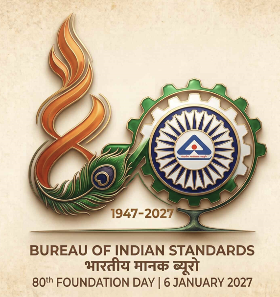
This commemorative logo design centers around a vibrant, stylized interpretation of the number "80" set against a subtle, traditional mandala-patterned background. The numeral '8' is crafted as a dynamic, upward-sweeping saffron flame that seamlessly transitions into a detailed green peacock feather at its base. This fluid shape evokes the Devanagari numeral for eight ('८'), visually blending themes of national energy and growth with deep cultural roots and wisdom The '0' is constructed as a green industrial gear that houses the navy blue and white spokes of the Ashoka Chakra. Centered perfectly within this wheel is the official Bureau of Indian Standards (BIS) emblem. This half of the design grounds the cultural symbolism with industrial precision, representing robust quality infrastructure, standards, and continuous progress The two numerals are visually anchored by a sleek, dark green horizontal underline. Below the central graphic, bold bilingual typography reads "BUREAU OF INDIAN
Like
1
Dislike
0

9 hours 39 minutes ago
Concept Note (BIS@80 Logo Design)
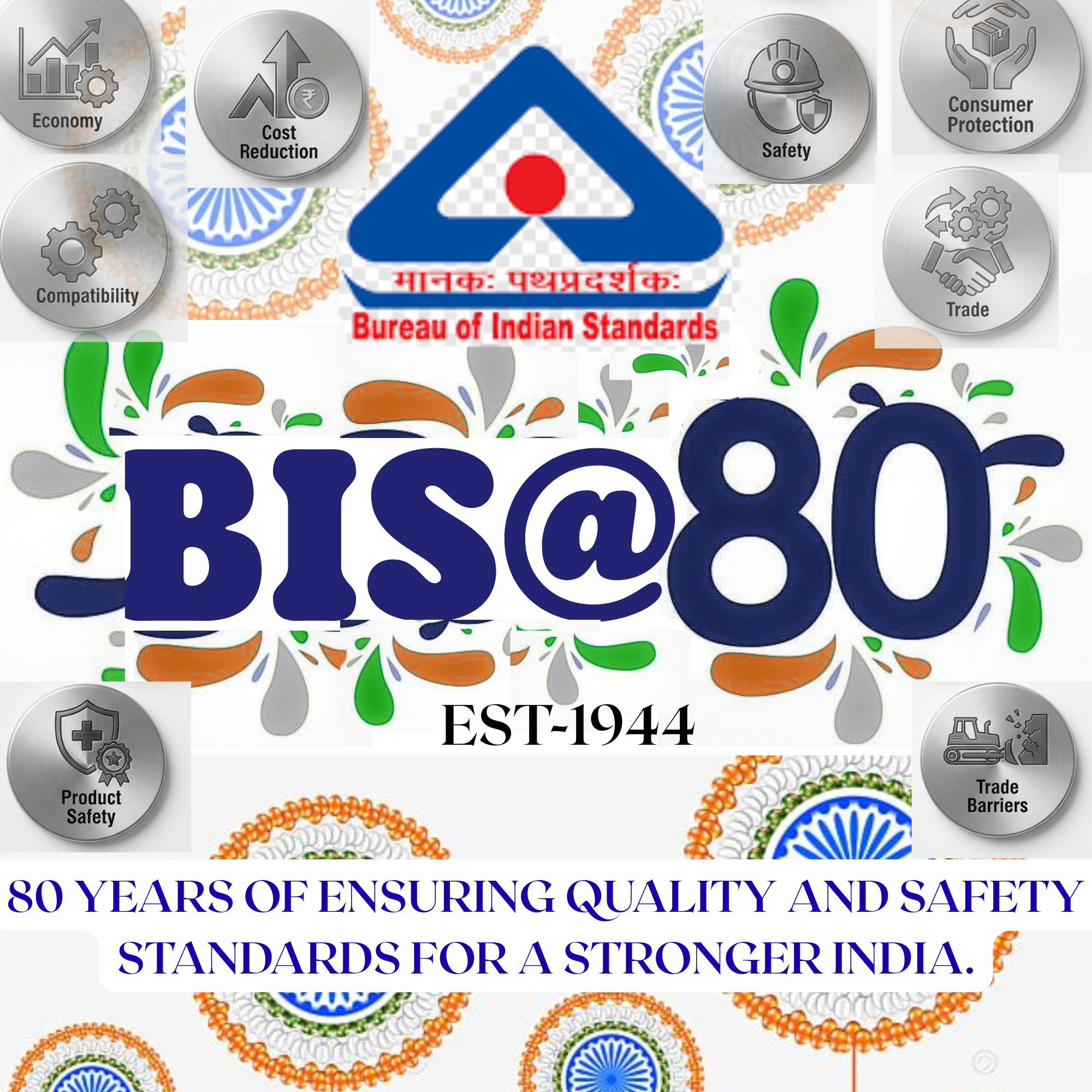
The BIS@80 logo celebrates eight decades of the Bureau of Indian Standards’ commitment to quality, safety, and national progress. The bold blue “BIS@80” signifies strength, trust, and continuity since its establishment in 1944. The tricolour motifs surrounding the design reflect the spirit of the Indian flag, symbolizing unity, patriotism, and inclusivity. The BIS emblem at the top reinforces the organization’s identity as the nation’s pathfinder in standardization. The surrounding icons—Economy, Cost Reduction, Compatibility, Safety, Consumer Protection, Trade, Product Safety, and Trade Barriers—represent BIS’s multifaceted role in enhancing industrial growth and consumer welfare. The tagline “80 Years of Ensuring Quality and Safety Standards for a Stronger India” encapsulates BIS’s enduring mission to build a resilient and self-reliant nation through excellence in standards.
Like
1
Dislike
1

10 hours 55 minutes ago
Concept Note – BIS@80
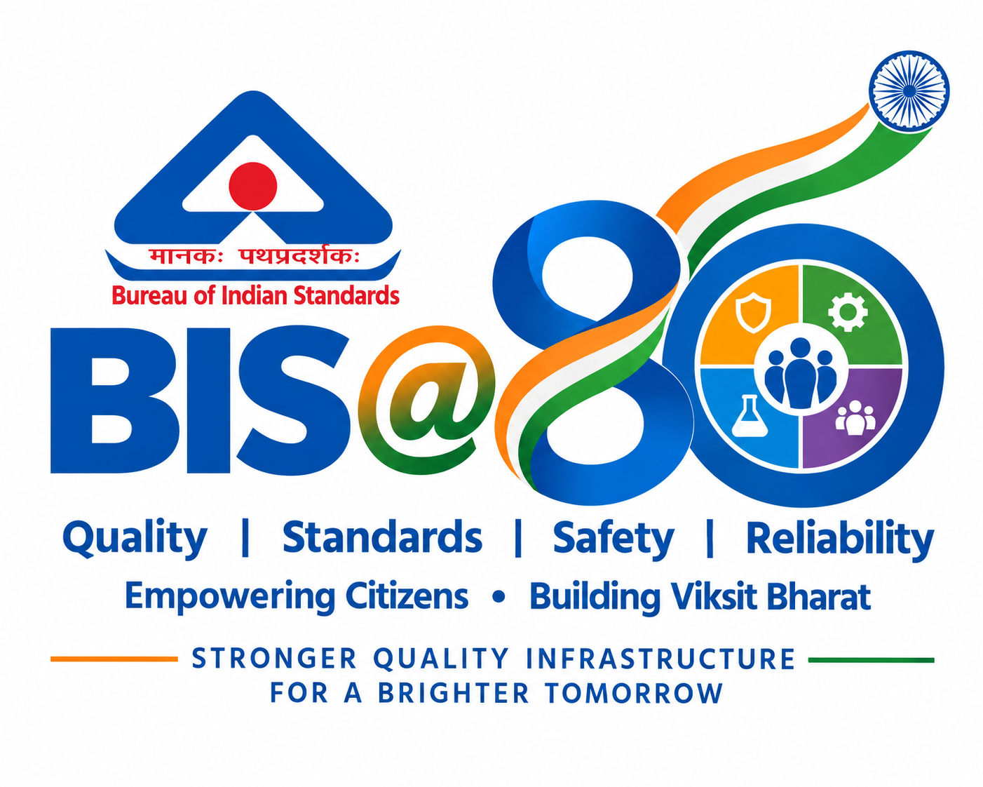
The BIS@80 logo celebrates eight decades of the Bureau of Indian Standards as India’s National Standards Body and its continuing commitment to quality, safety, reliability and consumer confidence.
The existing BIS emblem is placed prominently as an integral part of the design, preserving the identity and institutional legacy of BIS. The bold “80” represents eight decades of service, while its continuous form symbolises continuity, progress and the strengthening of India’s quality infrastructure.
The tricolour ribbon flowing through the “80” represents India’s journey towards a quality-driven and self-reliant nation. Its upward movement conveys progress towards Viksit Bharat, while the Ashoka Chakra represents national identity, responsibility and forward movement.
The circular elements and icons within the design represent key dimensions of BIS’s work: safety, testing, standardisation, conformity assessment and consumer awareness.
Like
1
Dislike
2

12 hours 12 minutes ago
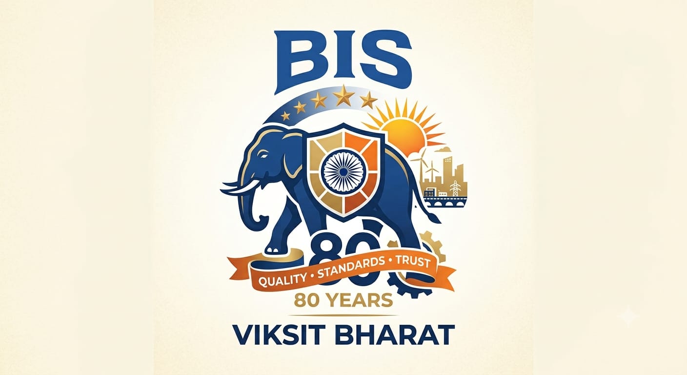
This emblem commemorates 80 years of the Bureau of Indian Standards in building a "Viksit Bharat" (Developed India). Central to the design is a strong blue elephant, symbolizing BIS’s steadfast commitment to quality and institutional strength.
The elephant carries a defensive shield featuring the Ashoka Chakra, representing standards as the safeguard of trust and safety. Flanked by gears and a developing cityscape with sustainable energy, the shield and sun symbolize progress fueled by reliable standards. An orange ribbon celebrates eight decades of "Quality • Standards • Trust," illustrating how BIS empowers the nation and shapes a prosperous future through strong quality infrastructure.
Like
1
Dislike
4
12 hours 52 minutes ago
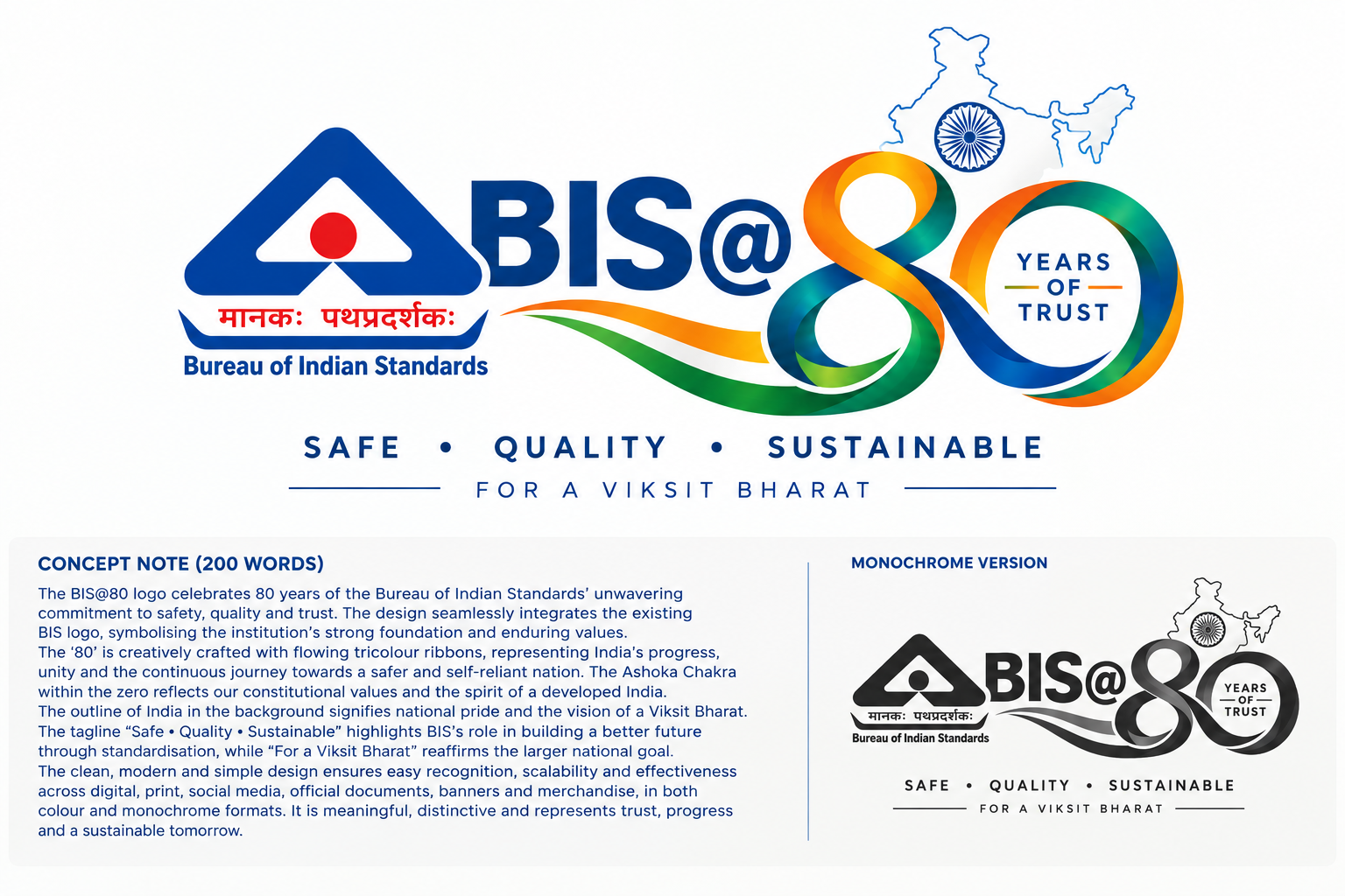
The BIS@80 logo celebrates eight decades of the Bureau of Indian Standards and its enduring commitment to quality, safety, reliability and consumer confidence. The existing BIS logo forms an integral part of the design, representing the strong foundation of standardisation and trust. The bold “80” symbolises eight decades of service, while its flowing form represents continuity, progress and BIS’s journey towards the future. The Indian tricolour elements reflect national pride, unity and India’s progress towards a Viksit Bharat. The Ashoka Chakra represents India’s national identity and the values of integrity and responsibility. The clean and contemporary composition is designed to remain distinctive, recognisable and scalable across digital platforms, print, official documents, banners, social media and merchandise. The colour and monochrome adaptability further ensure consistent visual identity across applications.
Like
1
Dislike
3

13 hours 44 minutes ago
80 years of setting standards. 80 years of building trust. 80 years of shaping India’s journey toward excellence. 🇮🇳
BIS@80 is more than a milestone—it is a celebration of the invisible foundation behind a stronger, safer and quality-driven Bharat. May the next chapter turn every standard into a step towards a Viksit Bharat. ✨
#BIS80 #BureauOfIndianStandards #QualityForAll #StandardsForProgress #ViksitBharat #QualityInfrastructure

Like
2
Dislike
4

14 hours 34 minutes ago
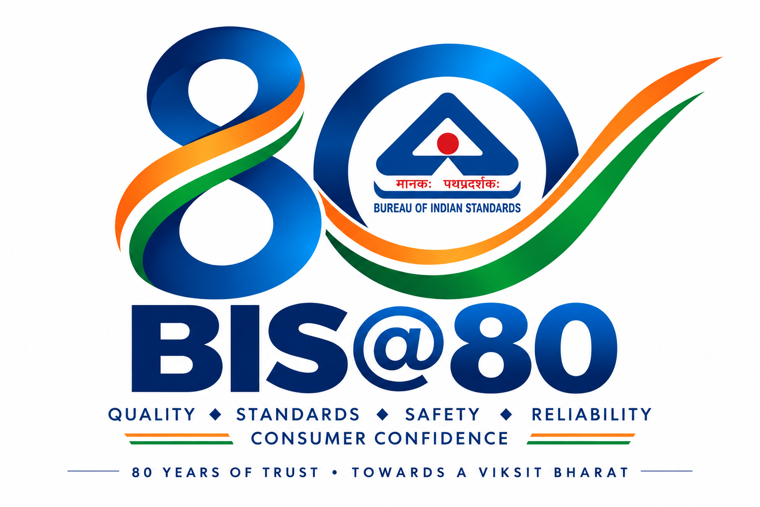
The BIS@80 logo celebrates eight decades of the Bureau of Indian Standards and its contribution to quality, standardisation, safety, reliability and consumer confidence. The number “80” forms the central identity, symbolising eight decades of service and continuous progress towards higher standards. The existing BIS emblem is integrated into the design to represent trust, authority and BIS’s role in India’s quality infrastructure. Flowing tricolour elements express national pride, progress and the journey towards a quality-driven Viksit Bharat. The clean and balanced form represents consistency and reliability, while the forward movement signifies innovation, growth and continuous improvement. The design is simple, distinctive, memorable and scalable for digital platforms, print, official documents, banners, social media and merchandise. It reflects BIS’s commitment to making quality an integral part of everyday life and empowering consumers through informed and confident choices.
Like
1
Dislike
5

15 hours 58 minutes ago
The Massive "Viksit Bharat" Harmonization: Over its 80 years, BIS has developed a staggering database of over 23,500 Indian Standards. In an exotic push for global dominance, 94 percent of these standards have been completely harmonized with international ISO and IEC norms, seamlessly blending Indian manufacturing into the global supply chain.80% Micro-Concessions: To mark its evolving role from a rigid regulator to a modern facilitator, BIS currently offers an symbolic 80% concession on minimum marking fees specifically to Micro-enterprises.The 5-Year Paradigm Shift: Capping off its 80th era, BIS executed one of its largest ease-of-doing-business overhauls via the Conformity Assessment Amendment Regulations. It shattered its traditional multi-decade rule of 2-year license renewals, extending standard mark and ISI license validities up to 5 years to empower long-term industrial planning.

Like
4
Dislike
4

16 hours 3 minutes ago
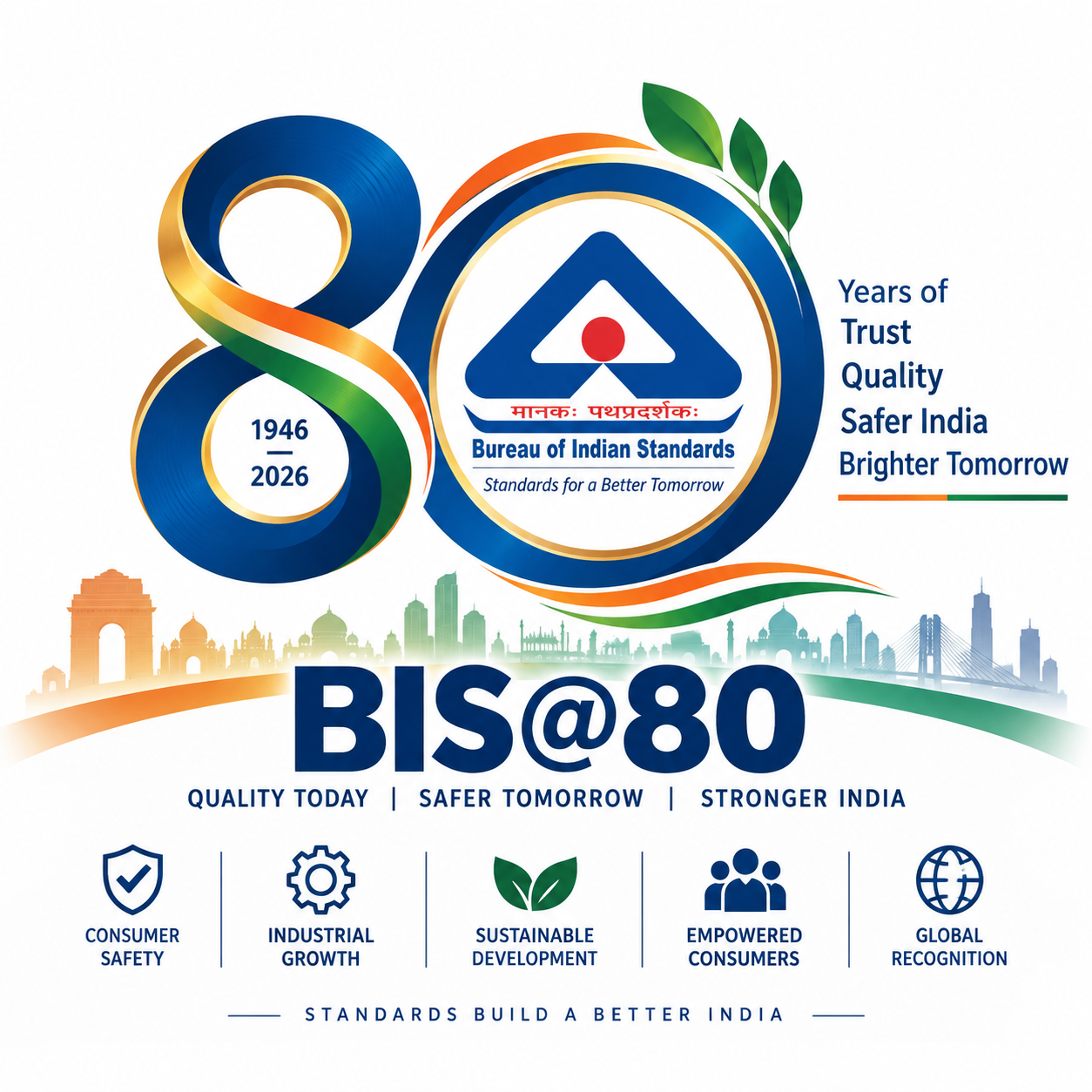
BIS@80 – 80 Years of Trust, Quality & Progress
The BIS@80 logo celebrates eight decades of BIS in building trust, promoting quality and strengthening consumer safety. The bold “80” represents its 80-year legacy, while the BIS identity reflects recognition and reliability. The flowing tricolour symbolises India’s unity and progress, while the circular form represents continuity and public trust. The upward movement reflects innovation and a stronger future. The design connects BIS’s heritage with quality, safety and sustainable development.
Like
2
Dislike
3

16 hours 25 minutes ago
इस लोगो में ‘80’ को BIS की 80 वर्षों की विश्वसनीय यात्रा और निरंतर प्रगति के प्रतीक के रूप में दर्शाया गया है। ‘80’ की संरचना में BIS का आधिकारिक लोगो शामिल है, जो मानकों, गुणवत्ता और उपभोक्ता विश्वास को दर्शाता है। लोगो में भारतीय तिरंगे से प्रेरित रंगों का प्रयोग राष्ट्रगौरव और विकसित भारत की भावना को प्रस्तुत करता है। गोलाकार रूप BIS की निरंतरता, एकता और भविष्य की ओर बढ़ते कदमों का प्रतीक है। सरल और आधुनिक डिजाइन इसे डिजिटल, प्रिंट, सोशल मीडिया तथा आधिकारिक उपयोग के लिए स्पष्ट और आसानी से पहचानने योग्य बनाता है। यह अवधारणा BIS की 80 वर्षों की विरासत को गुणवत्ता, सुरक्षा और भविष्य के भारत से जोड़ती है।
Like
1
Dislike
3
Please
Log In
to submit a comment.