 GOVERNMENT OF INDIA


प्रारंभ तिथि
17/09/2026 - 05:01
अंतिम तिथि
27/09/2026 - 23:45
Time zone: IST (GMT +5.30 Hrs)
767
इस टास्क में कुल सबमिशन
45
स्वीकृत
722
विचारधीन
निर्मित: 17/09/2026

8 hours 32 minutes ago
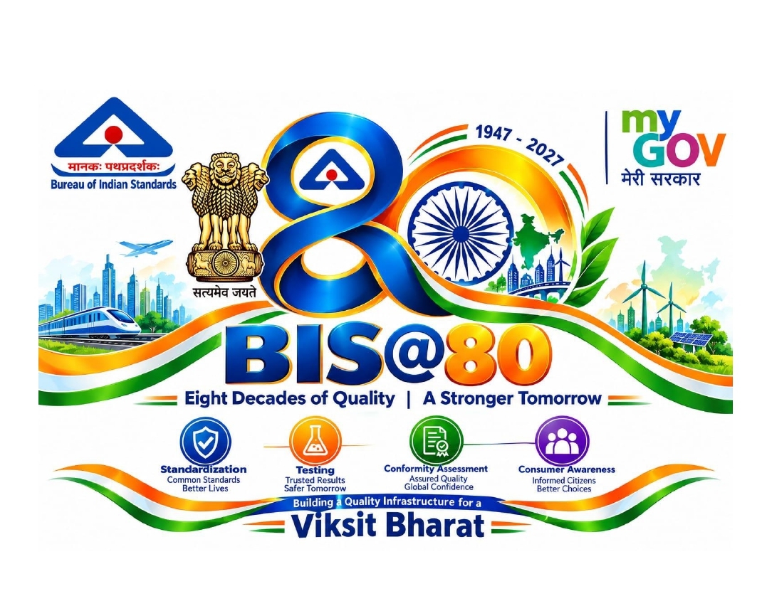
LOGO BIS@80भारतीय मानक ब्यूरो (BIS) 6 जनवरी 2027 को अपने गौरवमयी 80 साल पूरे करने जा रहा है। इस ऐतिहासिक अवसर को यादगार बनाने के लिए BIS ने MyGov के साथ मिलकर एक राष्ट्रीय लोगो डिजाइन प्रतियोगिता शुरू की है।यह मील का पत्थर देश की प्रगति, उपभोक्ता सुरक्षा और गुणवत्तापूर्ण बुनियादी ढांचे के निर्माण में BIS के अतुलनीय योगदान को दर्शाता है। पिछले आठ दशकों में BIS ने पारंपरिक मानकों से लेकर आधुनिक डिजिटल सुधारों तक का एक लंबा सफर तय किया है। BIS@80 का यह उत्सव न केवल इसकी ऐतिहासिक उपलब्धियों का जश्न मनाता है, बल्कि 'विकसित भारत' के सपने को साकार करने में इसकी महत्वपूर्ण भूमिका को भी रेखांकित करता है।
Like
1
Dislike
6

18 hours 13 minutes ago
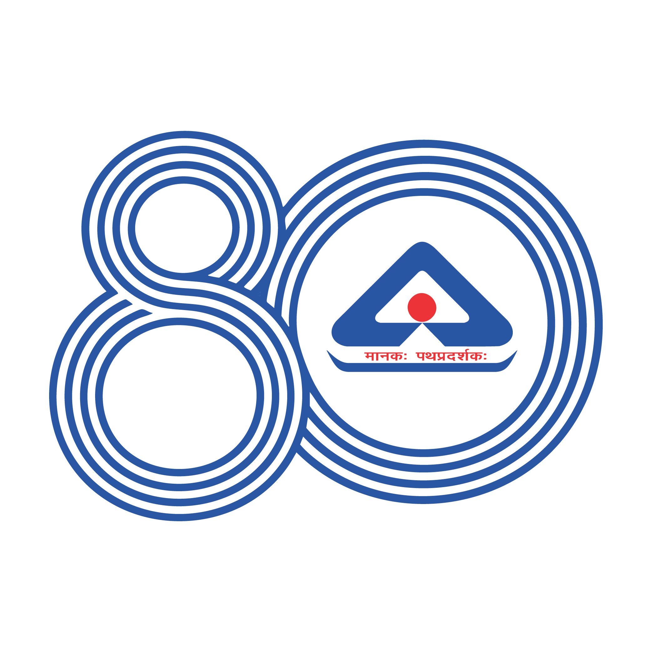
The BIS@80 logo identity expresses the number 80 through a series of continuous concentric lines, creating a simple yet distinctive visual language.
The multiple lines represent the eight decades of BIS’s journey—each layer reflecting the standards, systems and foundations built over time to strengthen quality, safety and reliability across India. Together, they form a unified 80, showing how every decade builds upon the one before it.
The continuity of the lines also represents the ongoing nature of standardisation. As India evolves, the pursuit of quality continues to move forward, carrying the foundation built over 80 years into the future and contributing to the vision of a Viksit Bharat.
Eight decades of standards. One continuous journey towards a better India.
Like
2
Dislike
6

19 hours ago
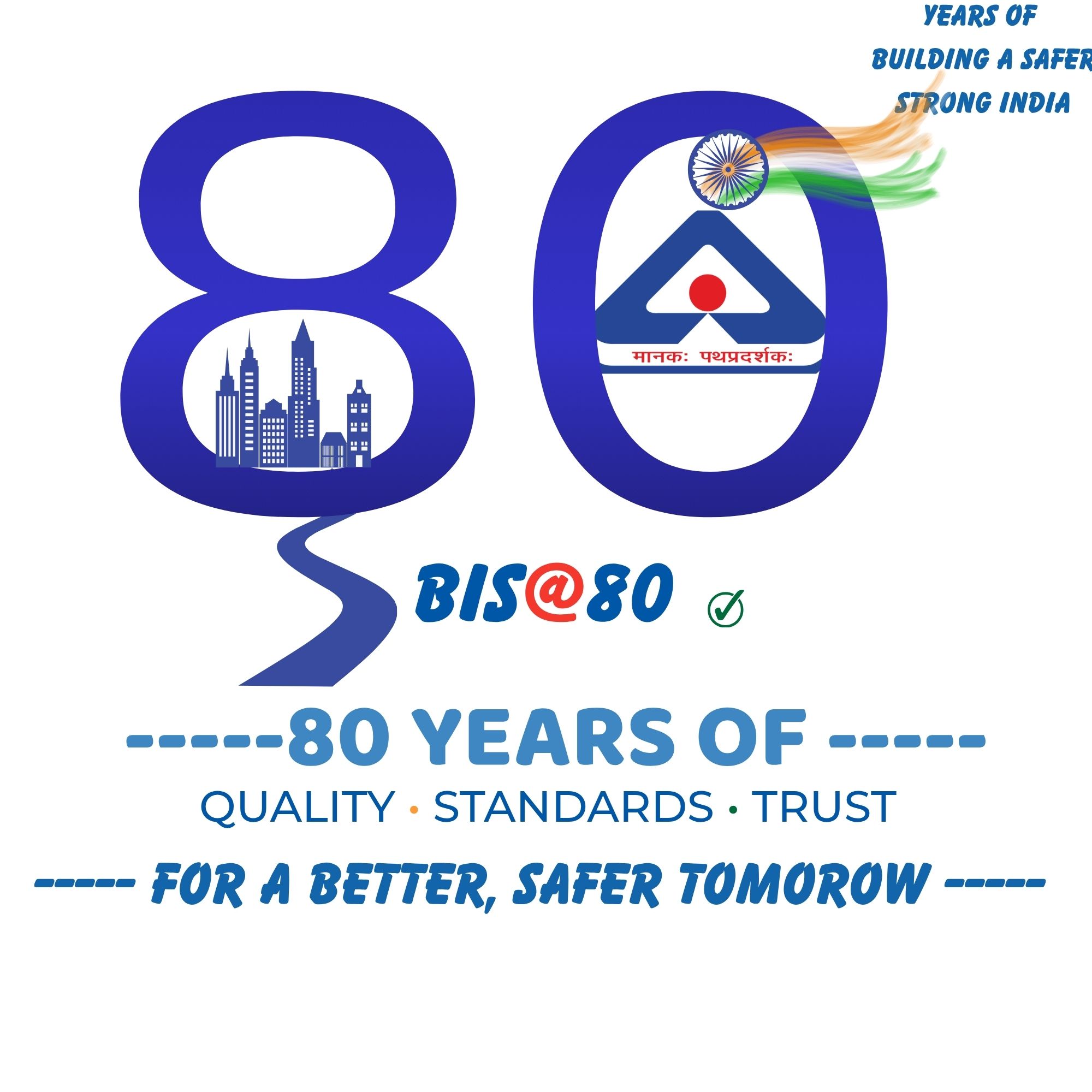
BY GAURANG BHALIYA
Like
2
Dislike
6

19 hours 49 minutes ago
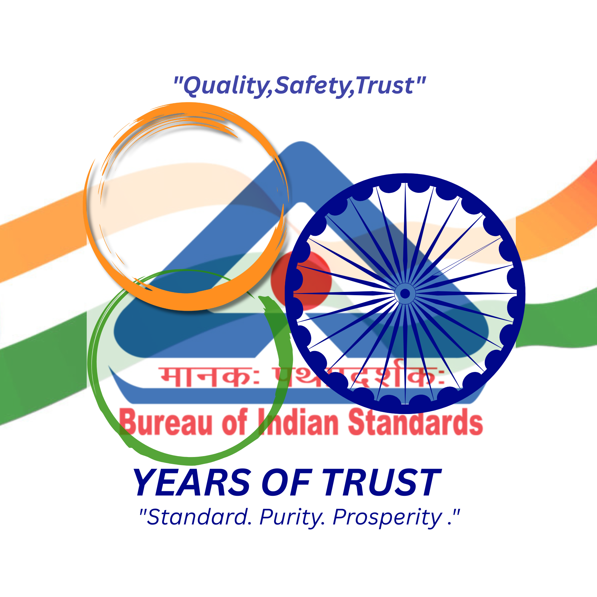
Since the original BIS logo is an established and recognizable symbol, I did not want to create an entirely different logo that could lose its identity. Instead, I made creative modifications to the existing BIS identity to give it a special 80th-anniversary appearance. The design highlights “80 Years of Trust,” representing eight decades of confidence that Indians have placed in BIS. The Indian tricolour and Ashoka Chakra reflect our national identity, while the circular elements represent continuity, unity, and the lasting relationship between BIS and the people of India. The design celebrates BIS’s 80-year journey while preserving its familiarity, identity, and trust.
Like
3
Dislike
6

20 hours 44 minutes ago
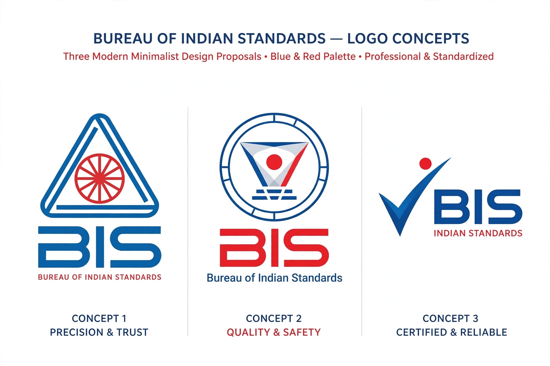
Bureau of Indian Standards ke liye 3 naye modern logo concepts bana diye hain 👇
*Concept 1 - Precision & Trust:* Triangle mein Ashok Chakra, original BIS ki pehchan ko modern look diya hai.
*Concept 2 - Quality & Safety:* ISI mark ko gol seal mein dikhaya hai, quality check jaisa feel.
*Concept 3 - Certified & Reliable:* Tick mark wala, sabse modern aur simple - BIS certified ka matlab.
Like
1
Dislike
9

22 hours 44 minutes ago
The BIS@80 logo is designed as a modern and premium representation of 80 years of the Bureau of Indian Standards and its contribution to quality, safety and trust in India. The existing BIS identity is placed at the heart of the design, ensuring that the organisation’s established visual recognition remains connected with the anniversary concept.
The prominent “80” represents eight decades of service and achievement. Its metallic blue and golden appearance symbolises reliability, excellence, celebration and a strong legacy. The golden highlights around the lettering add a sense of prestige while emphasising the importance of the 80-year milestone.
The map of India represents the nationwide presence and contribution of BIS. The saffron, white and green colours reflect India’s national identity, unity and pride. The flowing tricolour ribbon represents continuity, movement and progress towards the future.
Like
0
Dislike
8

1 day ago
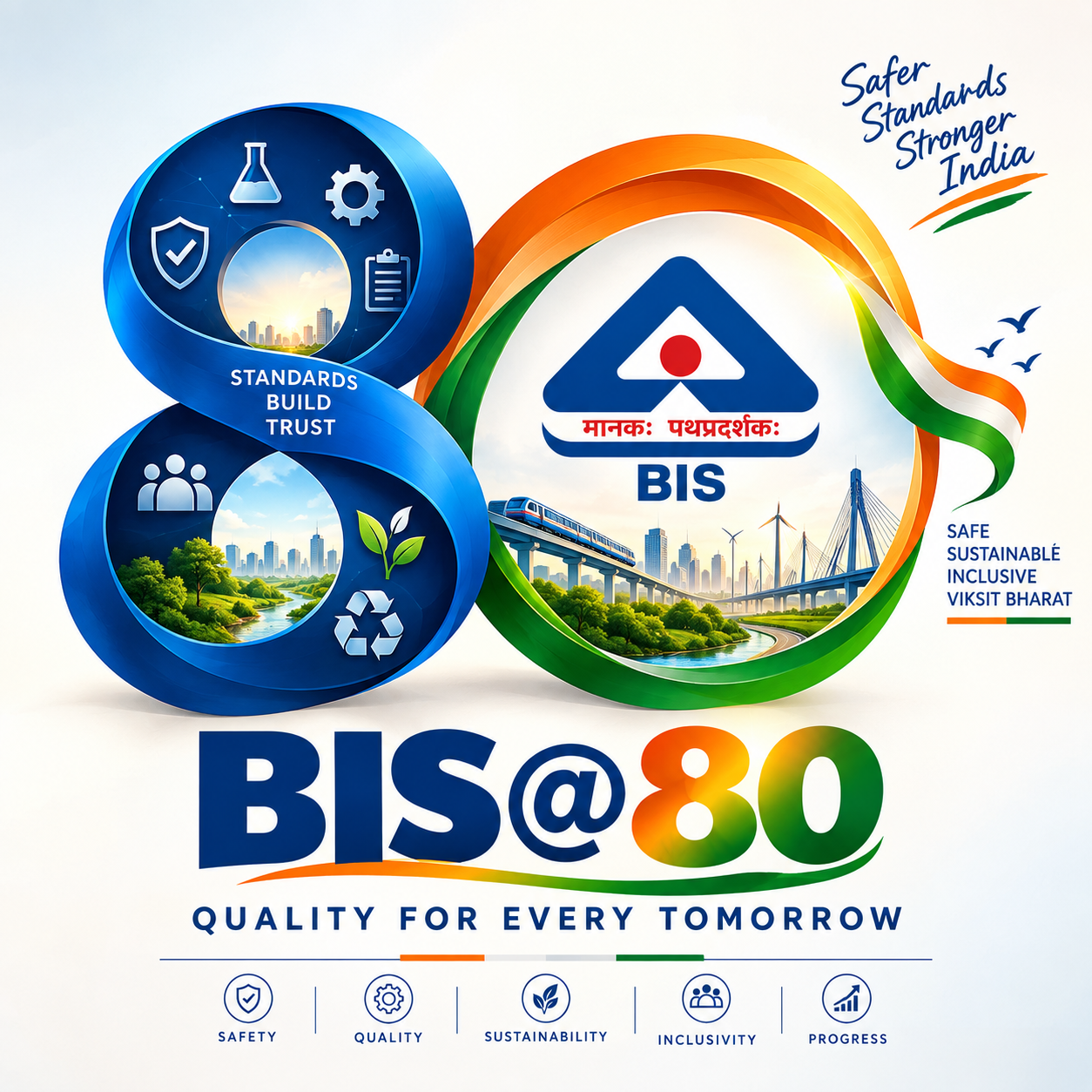
**Concept Note – BIS@80**
The BIS@80 logo celebrates 80 years of trust, quality and service to the nation. The existing BIS logo is an integral part of the design, representing the strong identity and legacy built by BIS over the decades.
The bold “80” marks this important milestone, while its flowing form represents continuity, progress and the journey towards the future. The saffron and green elements bring a sense of Indian identity and symbolise energy and growth, while blue reflects trust, stability and professionalism. The circular, wheel-inspired element represents standards, precision and continuous improvement.
The simple and clean design is intended to remain recognisable across digital platforms, print, official documents, banners and merchandise. Overall, BIS@80 represents **80 years of trusted standards, meaningful progress and a commitment to a better-quality India.**
Like
6
Dislike
8

1 day ago
I am excited to participate in the BIS@80 Commemorative Logo Design Competition. My design represents the journey, trust, quality, standards, and innovation associated with BIS over the past 80 years. I have tried to create a simple, modern, and meaningful concept that reflects BIS’s contribution to quality and standardisation in India. I hope my design captures the spirit of BIS@80 and its vision for a stronger and better future. Thank you for providing this opportunity to showcase creativity.

Like
4
Dislike
7

1 day 2 hours ago
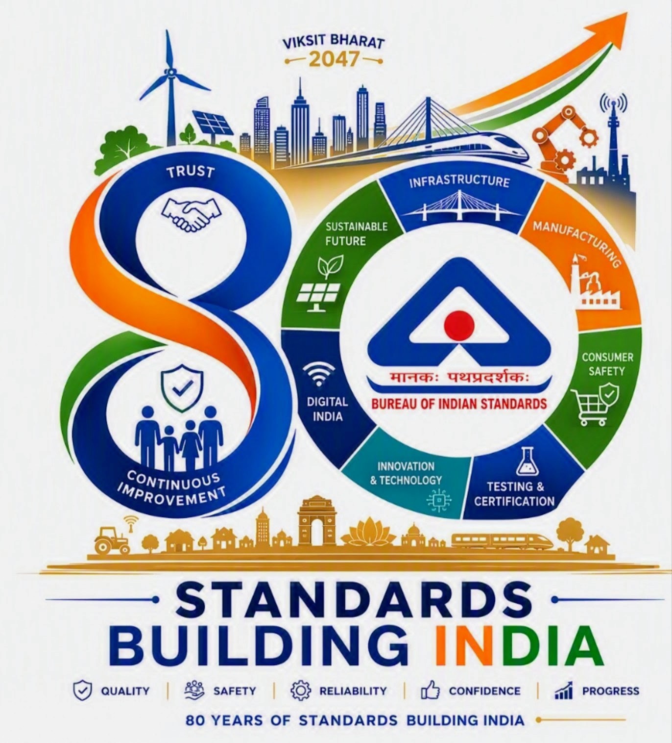
80 Years of Excellence with BIS
For eight decades, the Bureau of Indian Standards (BIS) has served as the bedrock of quality, safety, and reliability across the nation. As India charges ahead toward the vision of Viksit Bharat 2047, standards remain the invisible force driving sustainable growth, modern infrastructure, and technological innovation.
From powering renewable energy and expanding digital networks to driving advanced manufacturing and consumer safety, BIS ensures that every step forward meets world-class quality. The journey of standardisation bridges traditional trust with futuristic ambition, empowering industries, protecting consumers, and positioning India as a global leader in quality assurance.
Together, through continuous improvement, innovation, and an unyielding commitment to excellence, we build a safer, stronger, and self-reliant nation.
Like
2
Dislike
8

1 day 3 hours ago
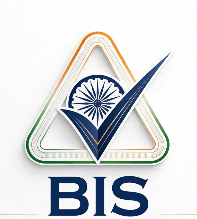
This logo commemorates 80 years of Bureau of Indian Standards. 1.Outer Triangle:The iconic BIS triangle retained, now with Tricolor gradient (Saffron-White-Green) symbolizing India's unity and Viksit Bharat vision. The dual lining shows strength and standardization layers. 2.Central Ashoka Chakra + Tick Mark:* The Ashoka Chakra represents Indian heritage and national standard. Merged with a bold blue checkmark(✓), it signifies "Tested, Verified, Approved" - the core promise of BIS. The tick cutting through shows quality assurance. 3. Color - Navy Blue:* Represents trust, authority, and reliability of BIS. 4. Gold inner line:* Subtle gold line honors BIS hallmarking for gold purity.
Like
1
Dislike
13
Please
Log In
to submit a comment.