 GOVERNMENT OF INDIA


Start Date
17/09/2026 - 05:01
End Date
27/09/2026 - 23:45
Time zone: IST (GMT +5.30 Hrs)
876
Total Submissions in this Task
51
Approved
825
Under Review
Created: 17/09/2026

12 hours 8 minutes ago
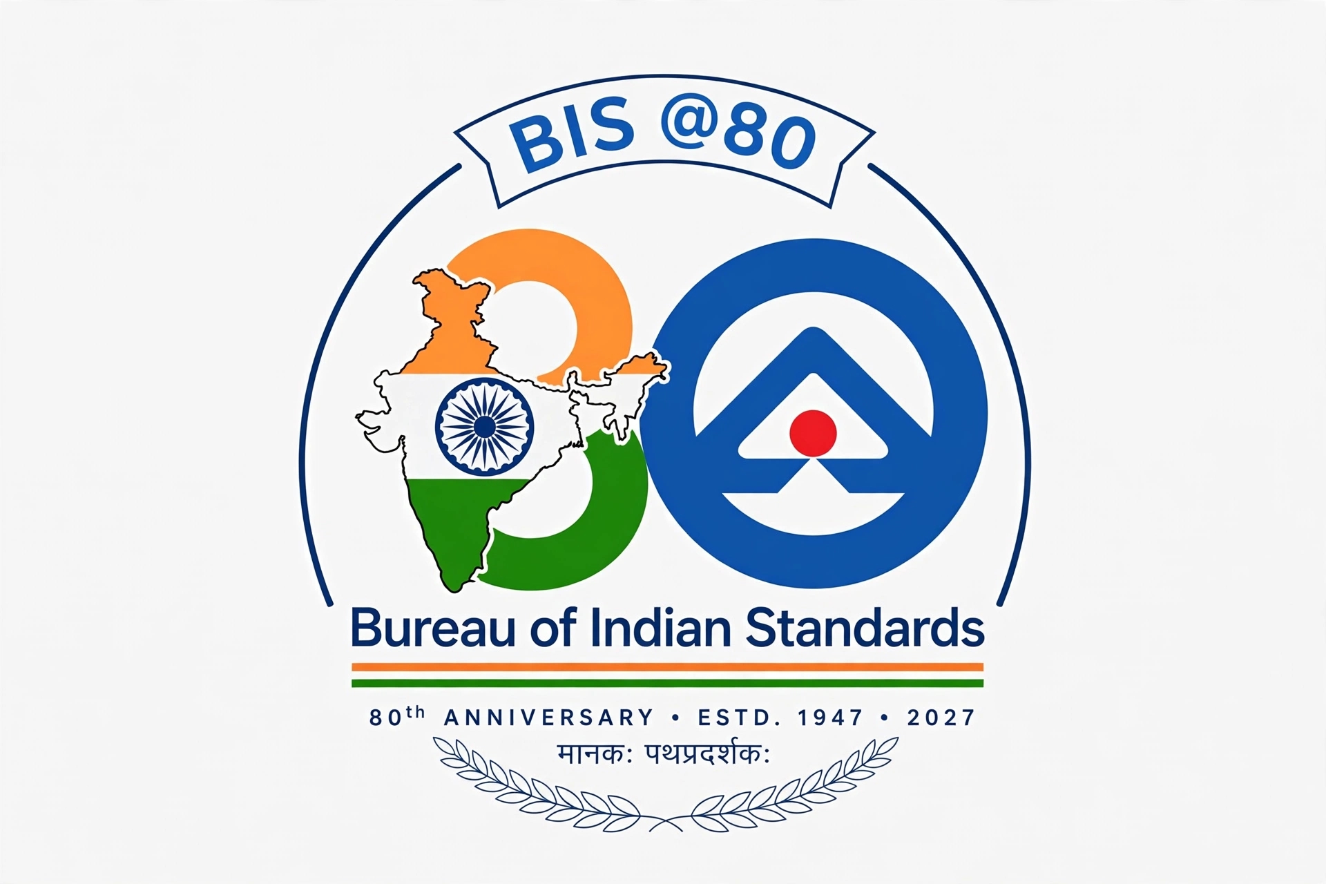
80 Years of Trust. 80 Years of Quality. One Vision for a Stronger India.
This logo celebrates eight remarkable decades of the Bureau of Indian Standards (BIS)—a journey that has helped build trust, promote quality and strengthen the foundation of a safe and progressive India. The “80” symbolises a proud national legacy, while the modern design reflects India’s forward-looking spirit, innovation and ambition.
More than a celebration of a milestone, BIS@80 represents a shared national commitment to excellence. It honours BIS’s role in raising standards, empowering consumers, supporting industries and contributing to India’s growth and global recognition. The logo connects the achievements of the past with the aspirations of a new India—where quality, safety, innovation and trust become the foundation of a stronger future.
BIS@80 is not just 80 years of standards; it is 80 years of building confidence in India.
Like
2
Dislike
4

13 hours 29 minutes ago
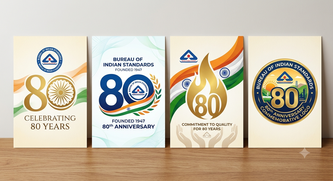
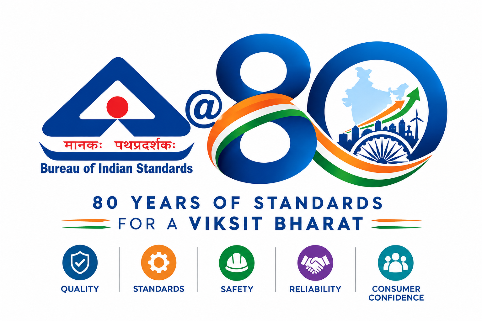
The BIS@80 logo celebrates eight decades of the Bureau of Indian Standards’ commitment to quality, safety, reliability and consumer confidence. The existing BIS logo is integrated with a bold “80” to represent the organisation’s continuous journey of setting and promoting standards in India.
The flowing tricolour ribbon symbolizes continuity, national identity and the evolving journey of BIS towards a stronger and more developed India. The map of India represents the nationwide impact of standards, while the Ashoka Chakra reflects progress, integrity and the nation’s values. The upward arrow signifies growth, innovation and India’s journey towards a Viksit Bharat.
The clean and modern design makes the logo distinctive, memorable and adaptable across different applications. Overall, the logo represents BIS’s enduring legacy and its continued role in building trust, promoting quality and supporting India’s progress.
Like
4
Dislike
6

14 hours 1 minute ago
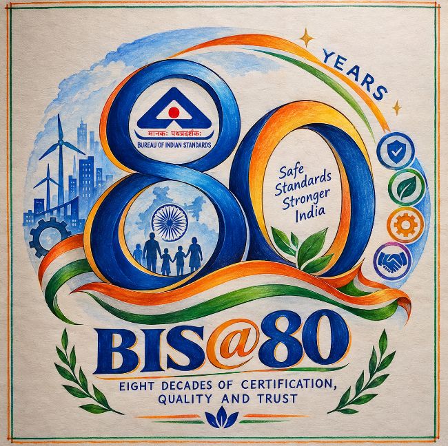
) के 80 वर्षों की यात्रा, गुणवत्ता, सुरक्षा, प्रमाणन और भारत के विकास को दर्शाती है। चित्र को बहुत सुंदर, आकर्षक और देशभक्ति की भावना से भरपूर तरीके से बनाया गया है। इसमें मुख्य रूप से “BIS@80” लिखा हुआ है, जो BIS के 80 वर्षों के योगदान का प्रतीक है। चित्र का पूरा संयोजन इस बात को दर्शाता है कि भारत की प्रगति में गुणवत्ता और मानकों का कितना महत्वपूर्ण स्थान है। चित्र में नीला, केसरिया, हरा और सफेद रंग प्रमुख रूप से दिखाई देते हैं, जो भारतीय तिरंगे और राष्ट्रीय भावना की याद दिलाते हैं।
चित्र के सबसे प्रमुख भाग में BIS का प्रतीक दिखाई देता है। BIS का चिन्ह एक बड़े नीले गोलाकार आकार के अंदर बनाया गया है। उसके बीच में त्रिकोण के आकार का चिन्ह है और उसके नीचे “भारतीय मानक” तथा “Bureau of Indian Standards” लिखा हुआ दिखाई देता है। यह चिन्ह भारत में वस्तुओं और सेवाओं की गुणवत्ता तथा निर्धारित मानकों का प्रतीक है। इसके आसपास बने नीले और केसरिया घुमावदार आकार चित्र को बहुत सुंदर और गतिशील रूप देते हैं। ये घुमावदार आकृतियाँ BIS की लंबी यात्रा और निरंतर
Like
3
Dislike
5

16 hours 18 minutes ago
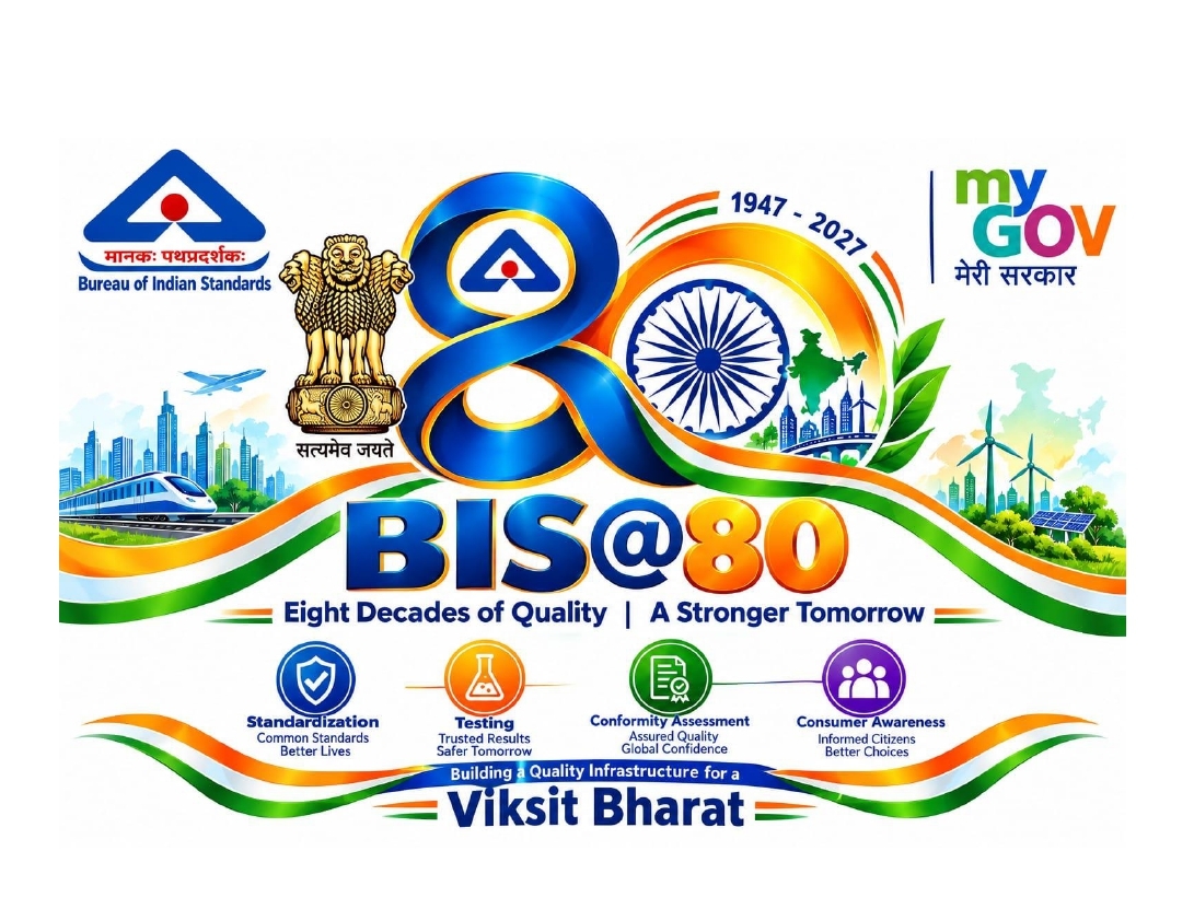
The BIS@80 commemorative logo celebrates eight decades of India's commitment to quality, safety, reliability, and standardization. The bold “BIS@80” typography represents strength, progress, and the enduring legacy of the Bureau of Indian Standards. The Ashoka Chakra integrated into the number 80 symbolizes India's national identity, continuous progress, and commitment to excellence. The Indian tricolour, flowing gracefully around the design, reflects unity, patriotism, and the spirit of a developing nation. The Ashoka Lion Capital represents integrity, authority, and public trust, while the BIS emblem highlights the organization's dedication to establishing reliable standards. The MyGov identity signifies citizen participation and collaborative nation-building. The accompanying words “Standards, Quality, Trust” communicate the core values of BIS. The clean, balanced graphic composition combines India's heritage with a modern visual identity, honouring the past while inspiring a future
(0.13 MB )
Like
2
Dislike
8

16 hours 19 minutes ago
Since the original BIS logo is an established and recognizable symbol, I did not want to create an entirely different logo that could lose its identity. Instead, I made creative modifications to the existing BIS identity to give it a special 80th-anniversary appearance. The design highlights “80 Years of Trust,” representing eight decades of confidence that Indians have placed in BIS. The Indian tricolour and Ashoka Chakra reflect our national identity, while the circular elements represent continuity, unity, and the lasting relationship between BIS and the people of India. The design celebrates BIS’s 80-year journey while preserving its familiarity, identity, and trust.
Like
1
Dislike
5

16 hours 32 minutes ago
short concept description. jpeg.
Like
1
Dislike
7
16 hours 39 minutes ago
LOGO BIS@80भारतीय मानक ब्यूरो (BIS) 6 जनवरी 2027 को अपने गौरवमयी 80 साल पूरे करने जा रहा है। इस ऐतिहासिक अवसर को यादगार बनाने के लिए BIS ने MyGov के साथ मिलकर एक राष्ट्रीय लोगो डिजाइन प्रतियोगिता शुरू की है।यह मील का पत्थर देश की प्रगति, उपभोक्ता सुरक्षा और गुणवत्तापूर्ण बुनियादी ढांचे के निर्माण में BIS के अतुलनीय योगदान को दर्शाता है। पिछले आठ दशकों में BIS ने पारंपरिक मानकों से लेकर आधुनिक डिजिटल सुधारों तक का एक लंबा सफर तय किया है। BIS@80 का यह उत्सव न केवल इसकी ऐतिहासिक उपलब्धियों का जश्न मनाता है, बल्कि 'विकसित भारत' के सपने को साकार करने में इसकी महत्वपूर्ण भूमिका को भी रेखांकित करता है।
Like
2
Dislike
7

1 day 2 hours ago
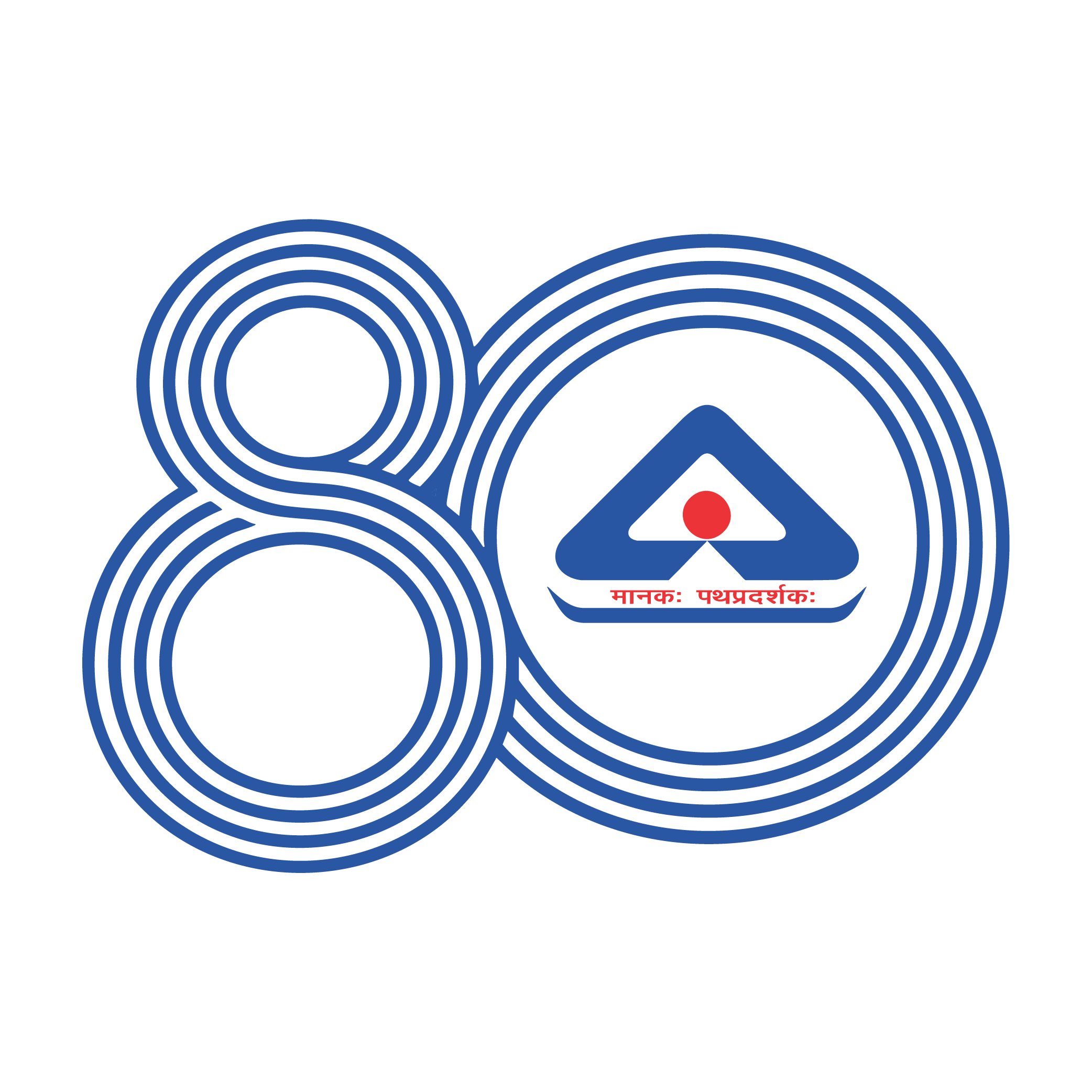
The BIS@80 logo identity expresses the number 80 through a series of continuous concentric lines, creating a simple yet distinctive visual language.
The multiple lines represent the eight decades of BIS’s journey—each layer reflecting the standards, systems and foundations built over time to strengthen quality, safety and reliability across India. Together, they form a unified 80, showing how every decade builds upon the one before it.
The continuity of the lines also represents the ongoing nature of standardisation. As India evolves, the pursuit of quality continues to move forward, carrying the foundation built over 80 years into the future and contributing to the vision of a Viksit Bharat.
Eight decades of standards. One continuous journey towards a better India.
Like
2
Dislike
7

1 day 3 hours ago
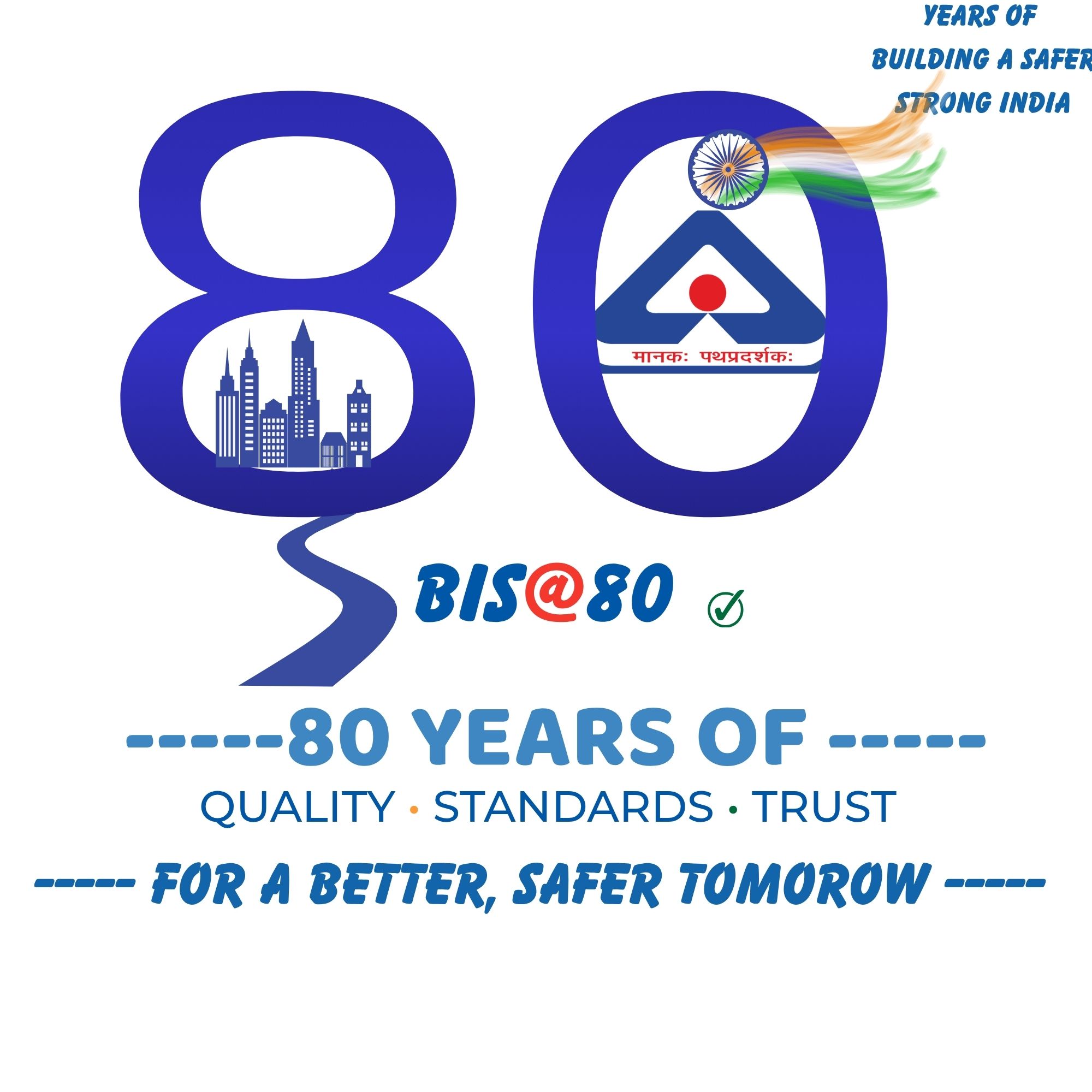
BY GAURANG BHALIYA
Like
3
Dislike
7

1 day 3 hours ago
Since the original BIS logo is an established and recognizable symbol, I did not want to create an entirely different logo that could lose its identity. Instead, I made creative modifications to the existing BIS identity to give it a special 80th-anniversary appearance. The design highlights “80 Years of Trust,” representing eight decades of confidence that Indians have placed in BIS. The Indian tricolour and Ashoka Chakra reflect our national identity, while the circular elements represent continuity, unity, and the lasting relationship between BIS and the people of India. The design celebrates BIS’s 80-year journey while preserving its familiarity, identity, and trust.

Like
3
Dislike
7
Please
Log In
to submit a comment.