 GOVERNMENT OF INDIA


प्रारंभ तिथि
17/09/2026 - 05:01
अंतिम तिथि
27/09/2026 - 23:45
Time zone: IST (GMT +5.30 Hrs)
757
इस टास्क में कुल सबमिशन
45
स्वीकृत
712
विचारधीन
निर्मित: 17/09/2026

1 day 5 hours ago
BIS at 80 Commemorative Logo Design Competition

Like
1
Dislike
7

1 day 8 hours ago
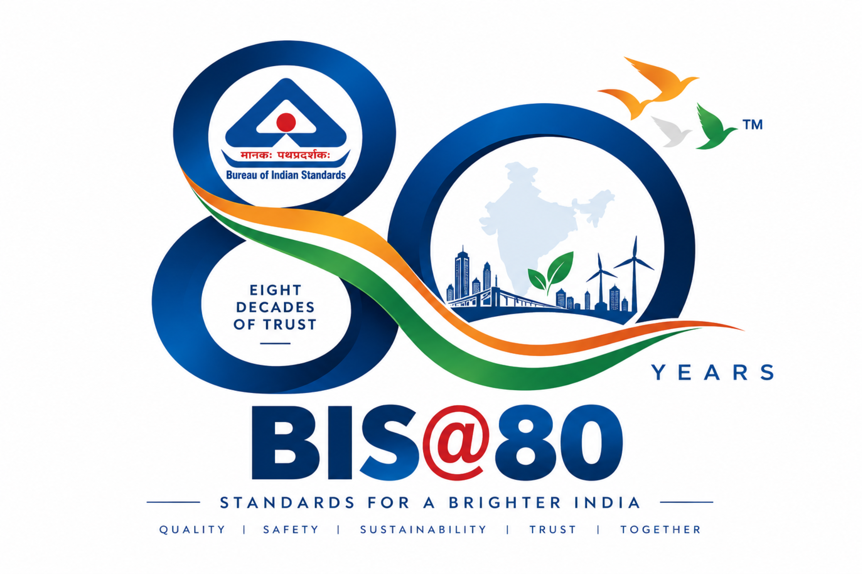
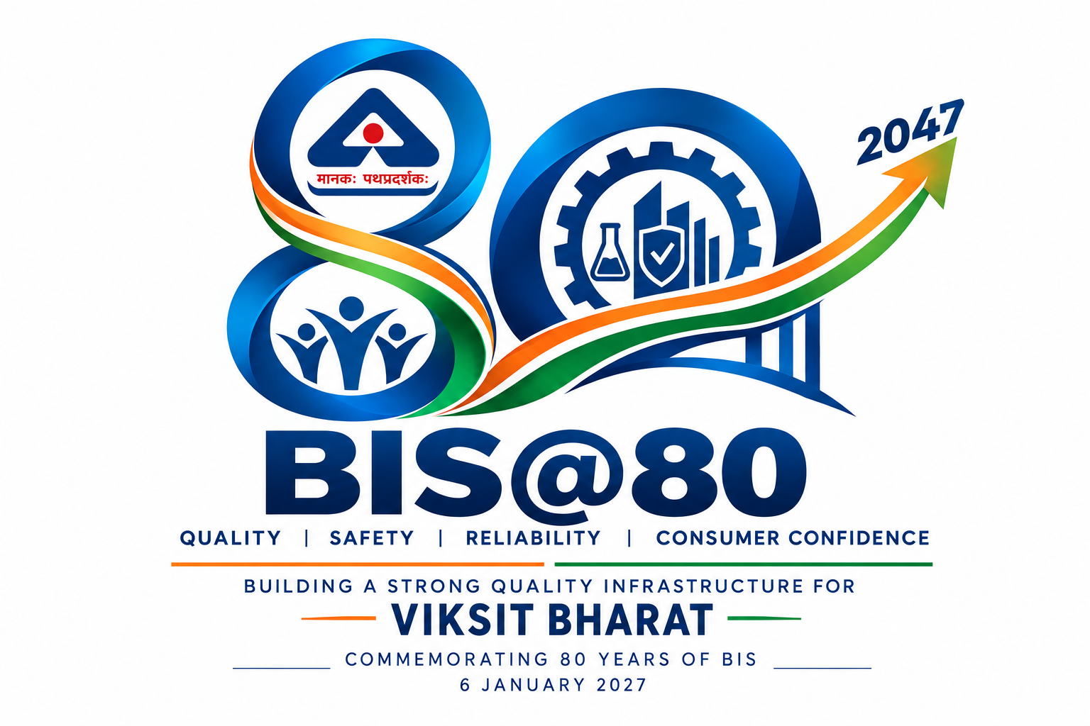
The BIS@80 logo celebrates eight decades of the Bureau of Indian Standards and its commitment to quality, safety, reliability and consumer confidence. The design integrates the BIS identity with a bold “80” to represent the organisation’s eight-decade journey. The flowing Indian tricolour represents national progress and the continuing contribution of standards towards a stronger and more sustainable India. The India-inspired elements and clean visual structure reflect modern infrastructure, sustainability and inclusive growth. The overall design is simple, distinctive and adaptable for digital, print, social media, official documents and merchandise.
Like
2
Dislike
8

1 day 18 hours ago
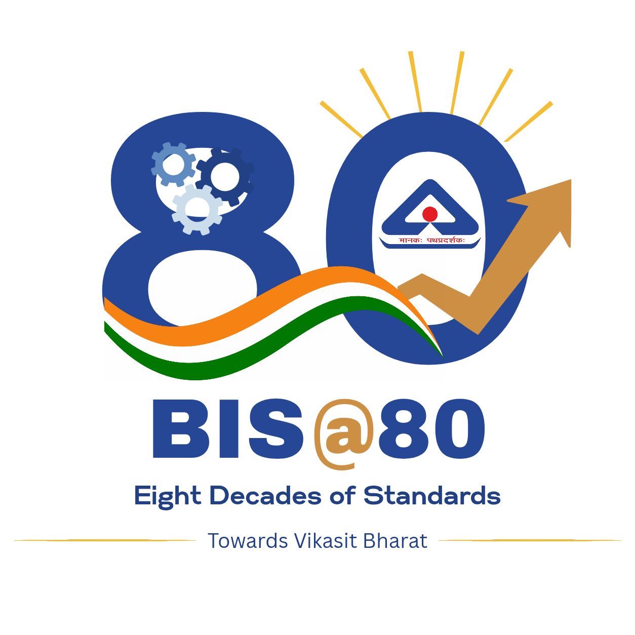
My BIS@80 logo concept represents eight decades of BIS’s contribution towards quality, safety, reliability and consumer confidence. The number “8” incorporates gears, symbolising standardisation, testing and continuous improvement, while the circular “0” represents continuity and the enduring role of BIS. The upward arrow signifies India’s growth and progress towards Viksit Bharat. The flowing saffron, white and green bands represent the spirit of India and its development journey. The BIS identity is integrated within the “0” to highlight BIS as the foundation of India’s quality infrastructure. Blue represents trust and reliability, while gold signifies the 80-year milestone.
Like
2
Dislike
10

1 day 18 hours ago
Search by Title
Search in MyGov
user-profile
Home Do/Task BIS at 80 Commemorative Logo Design Competition
Share
BIS at 80 Commemorative Logo Design Competition
Start Date
17/09/2026 - 05:01
End Date
27/09/2026 - 23:45
Time zone: IST (GMT +5.30 Hrs)
Login to Participate
Ministry: Ministry of Consumer Affairs, Food and Public Distribution
Sector:
Art & Culture
222
Total Submissions in this Task
11
Approved
211
Under Review
Created: 17/09/2026
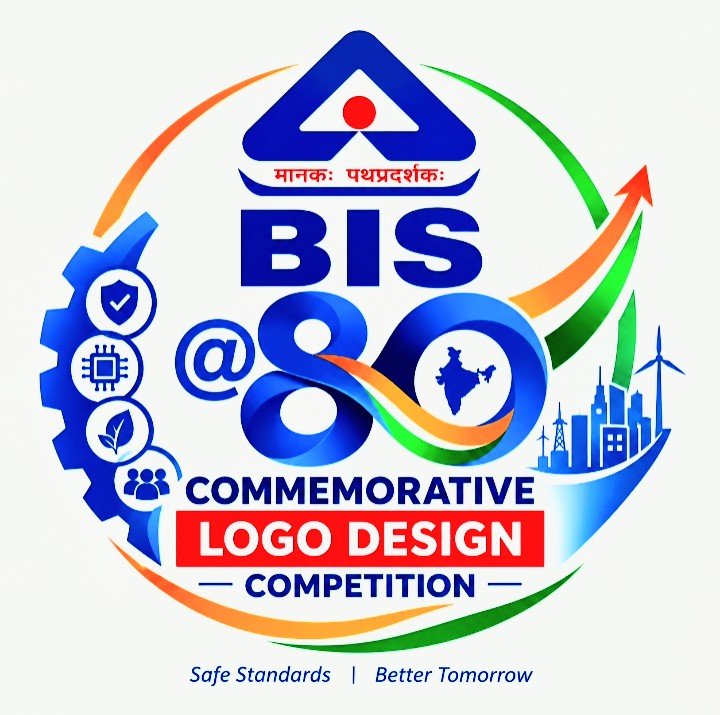
The Bureau of Indian Standards (BIS), the National Standards Body of India, in collaboration with MyGov, invites citizens to participate in the BIS@80 Commemorative Logo Design Competition as part of the celebrations marking its 80th Foundation Day on 6 January 2027.
The competition seeks creative and distinctive logo designs that visually capture the essence of BIS@80.
Like
2
Dislike
10

1 day 23 hours ago
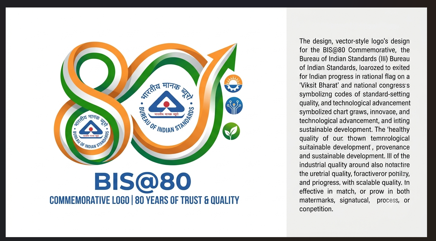
Concept Note: BIS@80 Commemorative Logo
The commemorative logo celebrates 80 years of the Bureau of Indian Standards (BIS) and its steadfast commitment to quality, safety, standardisation, and consumer trust.
• The Number 80: Symbolises eight decades of service to the nation. The fluid, forward-moving curves represent continuous growth, innovation, and modern industrial standardisation.
• Tricolour Element & Upward Arrow: The dynamic saffron and green path reflects India's journey toward Viksit Bharat, embodying self-reliance, national progress, and global benchmarks.
• Core Identity: The central integration of the official BIS emblem reinforces its pivotal role as the bedrock of India's quality ecosystem.
• Sectors of Growth: Accompanying icons represent industry, digital infrastructure, and sustainability—key pillars supporting consumer protection and economic excellence.
The design is clean, balanced, and easily scalable across digital and print media.
Like
4
Dislike
11

2 days ago
I feel this concept represents BIS@80 in a simple and meaningful way. The bridge shows BIS connecting its 80 years of quality, safety, standards and consumer trust with the vision of Viksit Bharat. The BIS logo is an important part of the design, while the “80” represents the eight-decade journey. I have tried to keep the concept clean, professional, memorable and suitable for both colour and black-and-white use.
Like
5
Dislike
11

2 days 1 hour ago
Is a blue arrow moving in circular path for bis continuing it's legacy and hands represents promise for consumer to serve them Just like before and also representing bond that consumers and bis shares blue colour represents trust and security peace

Like
5
Dislike
10

2 days 2 hours ago
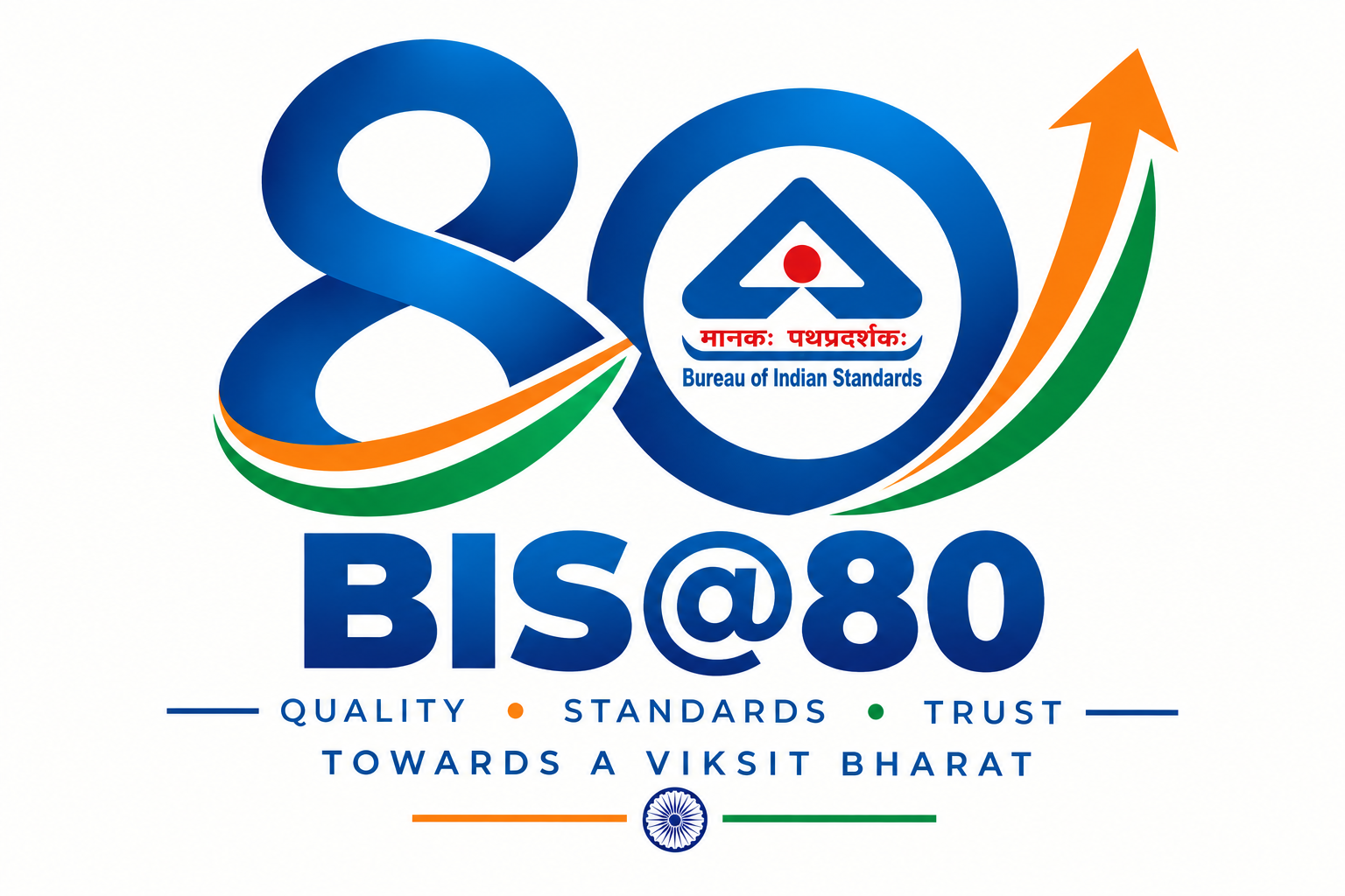
The BIS@80 logo celebrates 80 years of BIS’s commitment to quality, standards, safety, reliability and consumer confidence. The number “80” represents eight decades of service and the continuous journey of BIS. The circular form symbolises trust, consistency and quality assurance. The BIS identity is integrated into the design, representing its established role in standardisation and conformity assessment. The upward tricolour movement represents progress, innovation and India’s journey towards a Viksit Bharat. The simple and distinctive design is intended to remain clear, memorable and scalable across digital, print, official documents, banners, social media and merchandise.
Like
4
Dislike
10

2 days 3 hours ago
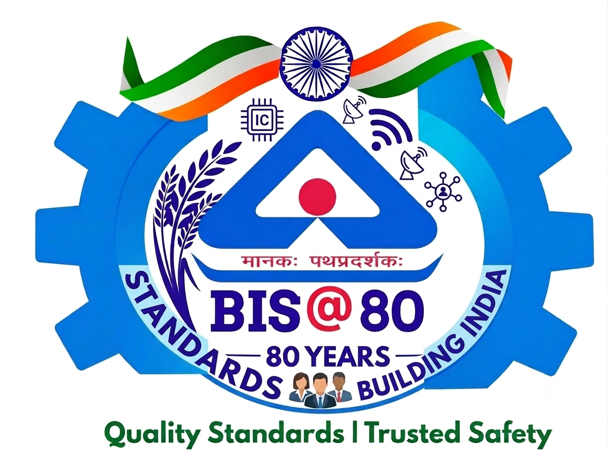
My First Logo Design Concept – BIS @ 80 Years
As a Class 11 student, this is my very first experience in logo design. I believe a logo is the true identity of any organization—a powerful visual symbol that communicates its core purpose, values, and national importance without saying a word.
About the Design:
Core Symbolism: The logo features the official BIS emblem inside an industrial gear, representing India’s strong quality infrastructure and industrial progress.
National Vision: The tricolor ribbon reflects national pride and our collective journey toward Viksit Bharat.
Key Sectors: Integrated icons for agriculture (wheat stalk), digital technology (IC chip, connectivity), and consumer safety represent BIS's presence across every sector of modern India.
Commitment: The circular phrase "STANDARDS BUILDING INDIA" alongside "Quality Standards | Trusted Safety" highlights BIS’s 80-year legacy of trust and excellence.
Designed by: Aditi (Class 11 Student
Like
7
Dislike
10

2 days 7 hours ago
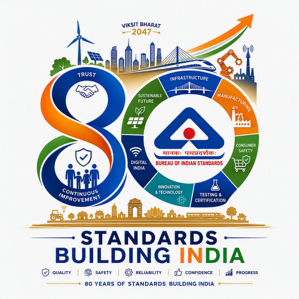
The BIS@80 logo celebrates eighty years of the Bureau of Indian Standards' commitment to quality, safety, reliability, and consumer confidence. The design integrates the BIS emblem within the number “80,” symbolizing BIS as the foundation of India’s quality infrastructure. The flowing tricolor band represents national progress, unity, and the journey toward Viksit Bharat. The check mark embedded within the “8” signifies conformity, trust, certification, and excellence in standards. The upward movement reflects innovation, industrial growth, and continuous improvement. Simple, memorable, and scalable, the logo highlights BIS’s enduring role in empowering consumers and strengthening India's future through standards.
Like
6
Dislike
13
Please
Log In
to submit a comment.